The Chart block turns a SQL query into a visualization, right inside a notebook or report: a bar, line, area, or donut chart, a ranked bar list, or a formatted table. Pick a source, pick a chart type, choose your measures, and you get a live preview. When the report runs, PushMetrics renders the chart to a PNG image that can be attached to an email, posted to Slack, or uploaded anywhere a report can deliver files.
This page covers the visual chart builder. If you need charts the builder cannot express, such as dual axis or combined bar and line charts, the same block also has a hand-written Plotly JSON editor. You can switch any chart between the two at any time, as described below.
How it works
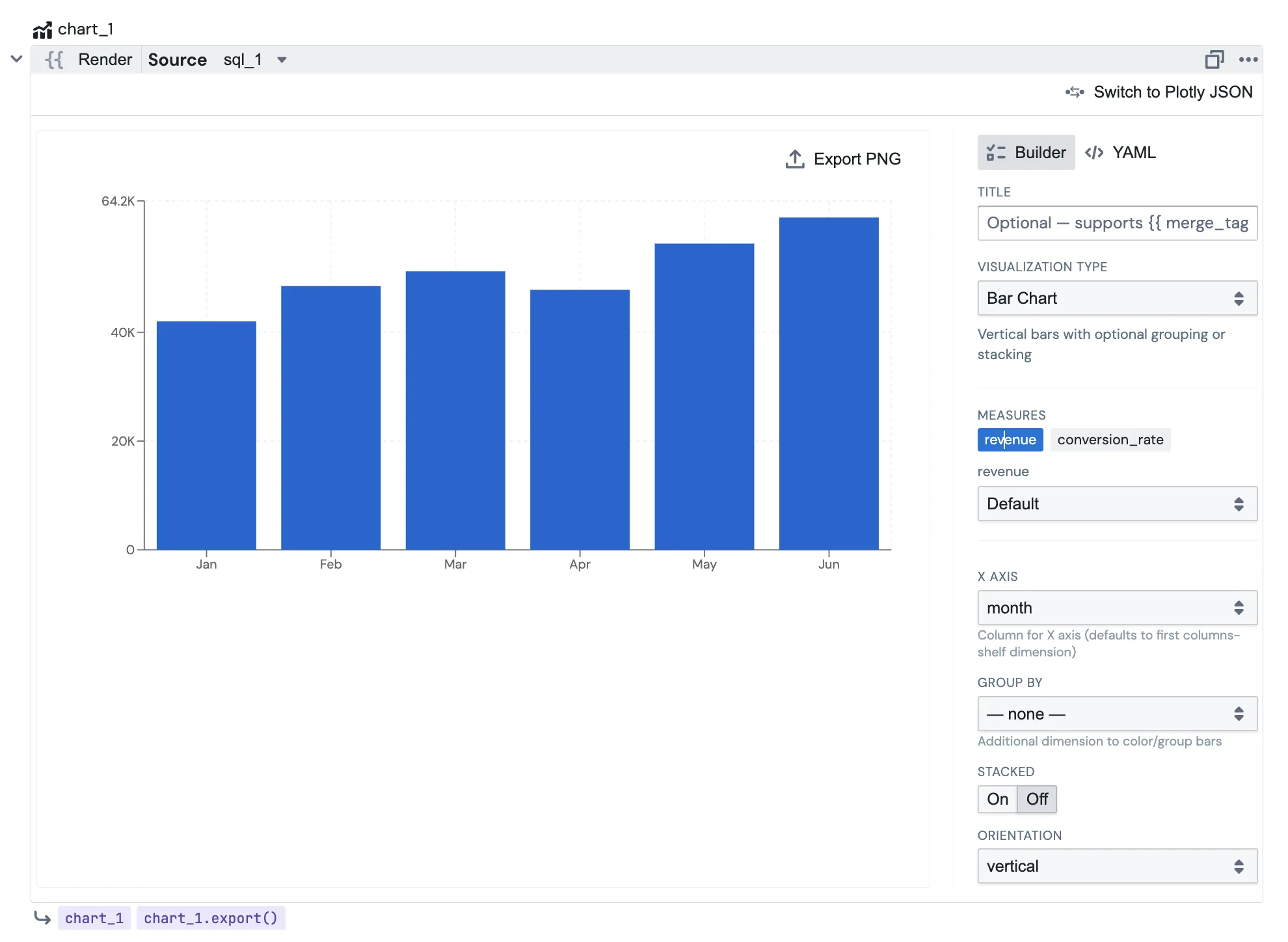
The Chart block reads its data from a SQL block in the same notebook. You point the chart at that block as its source, and the chart plots whatever columns the query returns. Every time the report runs, the source query runs first, and the chart is drawn fresh from the latest results.
Build a chart
Chart types
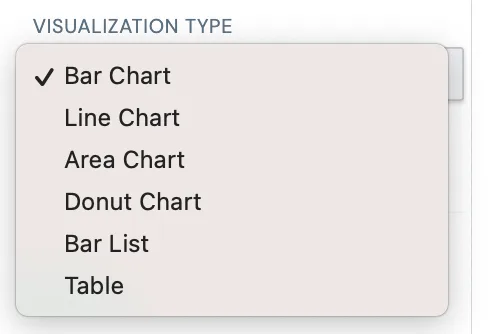
The block offers six visualization types:
| Type | Best for | Key settings |
|---|---|---|
| Bar Chart | Comparing values across categories or over time | X axis, Y measures, Group by, Stacked, Orientation (vertical / horizontal) |
| Line Chart | Trends over time | X axis, Y measures, Group by, Smooth lines |
| Area Chart | Trends with volume / cumulative feel | X axis, Y measures, Group by, Stacked |
| Donut Chart | Share of a whole (parts of a total) | Label dimension, Value measure, Inner hole % (0 = pie) |
| Bar List | A ranked top-N leaderboard | Label dimension, Value measure, Top N, Bar color |
| Table | Showing the underlying rows as a clean table | Column selection, inline bars, sticky first column |
Measures and formats
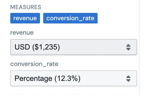
Click a column under Measures to plot it. Selected measures fill the chart's value axis automatically, so you don't have to pick them twice. Each selected measure gets its own number format dropdown (number, currency, percent, and so on), so a revenue series can show as $1,234 while a rate shows as 12.3% in the same chart.
Title with merge tags
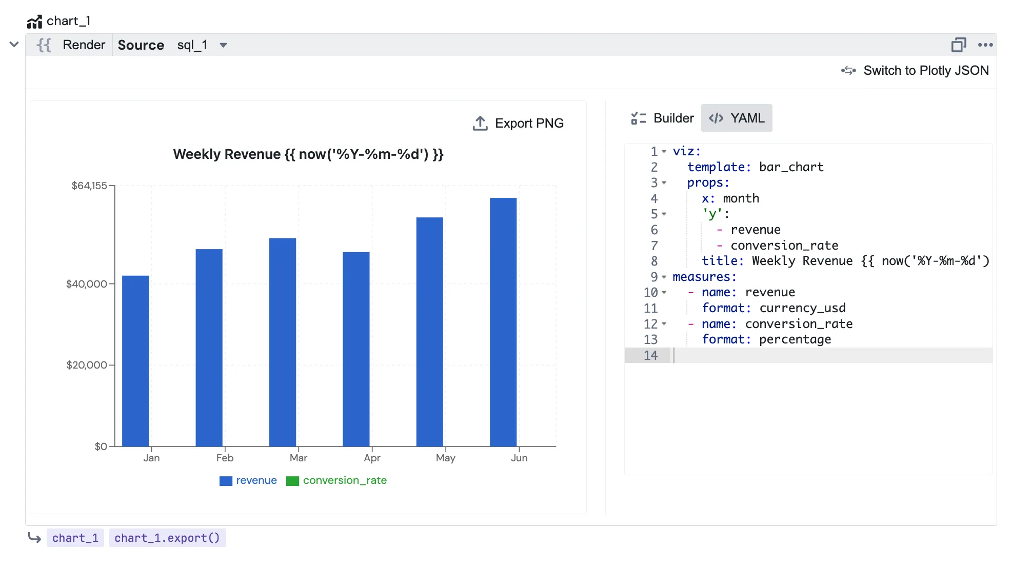
The optional Title field supports the full Jinja / merge-tag syntax used elsewhere in reports, so your chart heading can be dynamic:
Weekly Revenue {{ now('%Y-%m-%d') }}
{{ workspace.name }} Sales
Top region: {{ sql_1.data[0].region }}
Supported references include {{ workspace.name }}, {{ now('%Y-%m-%d') }} (and now().strftime(...)), {{ params.* }} / {{ parameter_N }}, and values from an earlier query such as {{ sql_1.data[0].column }}.
Use the {{ }} preview toggle in the block header to resolve the merge tags and see the final title (and formatted values) exactly as they'll render on export. While the preview is on, the settings are read-only. Toggle it off to keep editing.

Builder or YAML
Most people stay in Builder mode, the point-and-click panel. Power users can flip the segmented toggle at the top of the settings panel to YAML and edit the chart's full config (viz + measures) as text. The two views stay in sync: change something in YAML and it shows in the preview; switch back to Builder to refine it in the GUI. Invalid YAML shows an inline error and leaves your saved config untouched.
Send the chart to email or Slack
When the report runs, the Chart block renders a PNG image on the server from your latest data. Reference it from an Email or Slack block the same way you reference any other export:
{{ chart_1.export() }}
- In an Email or Slack block's Attachments,
{{ chart_1.export() }}attaches the chart as a.pngfile. - To embed the chart inline in an email body, put
{{ chart_1.export(embed=True) }}inside an<img src="…">tag and PushMetrics rewrites it to an inline image. - The same reference works as the Source for file-upload blocks (Google Drive, GCP Cloud Storage, SFTP), so you can archive the image too.
Replace chart_1 with your block's name. See Task Dependencies for the full .export() reference.
In the Execution Log
Open any run in the Execution Log and the Chart block shows a live, interactive version of the chart. Hover for tooltips, just like in the builder. Older executions fall back to the static PNG that was delivered.
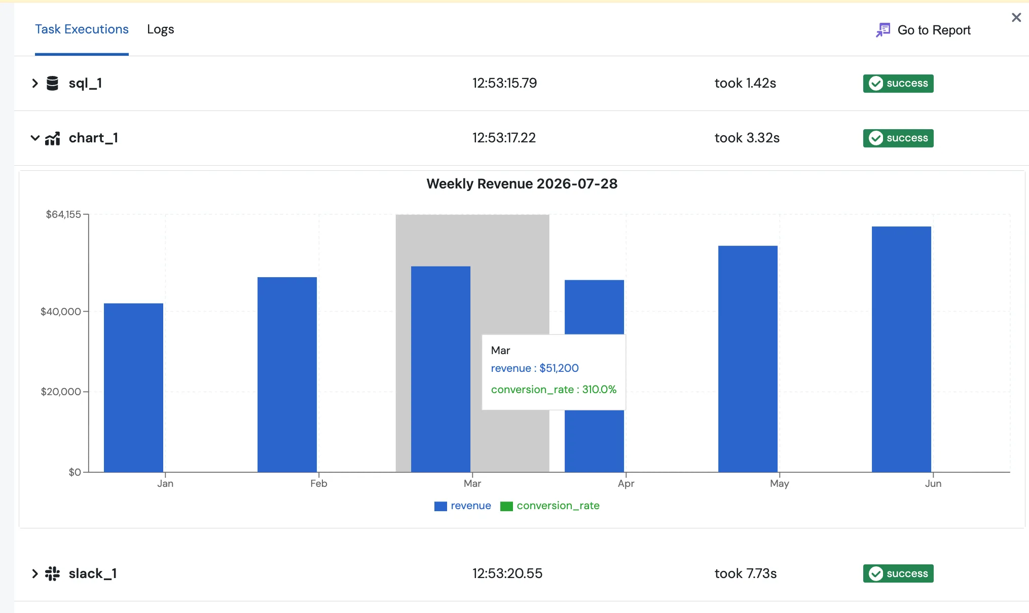
Chart builder or Plotly JSON
The Chart block has two editors, and every chart uses one of them:
- The chart builder described on this page. Guided, point and click, covers the common chart types.
- The Plotly JSON editor, where you write a Plotly figure spec by hand. It covers everything Plotly can draw, including dual axis charts, combined bar and line charts, and fully custom styling. See Plotly JSON Charts for the full guide.
Both produce the same server-rendered PNG and deliver to email and Slack the same way. You can switch any chart block between the two:
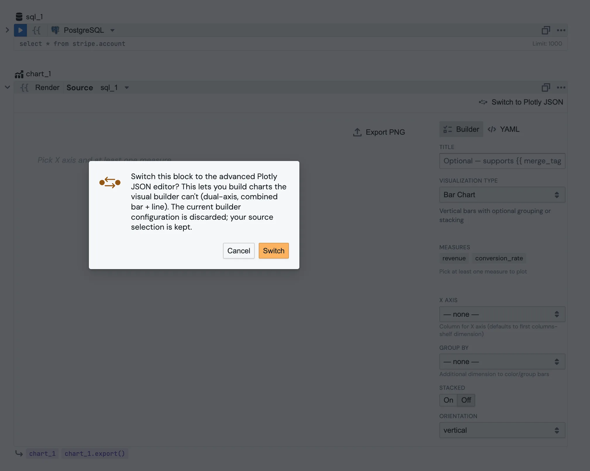
- In a builder block, click Switch to Plotly JSON in the settings panel.
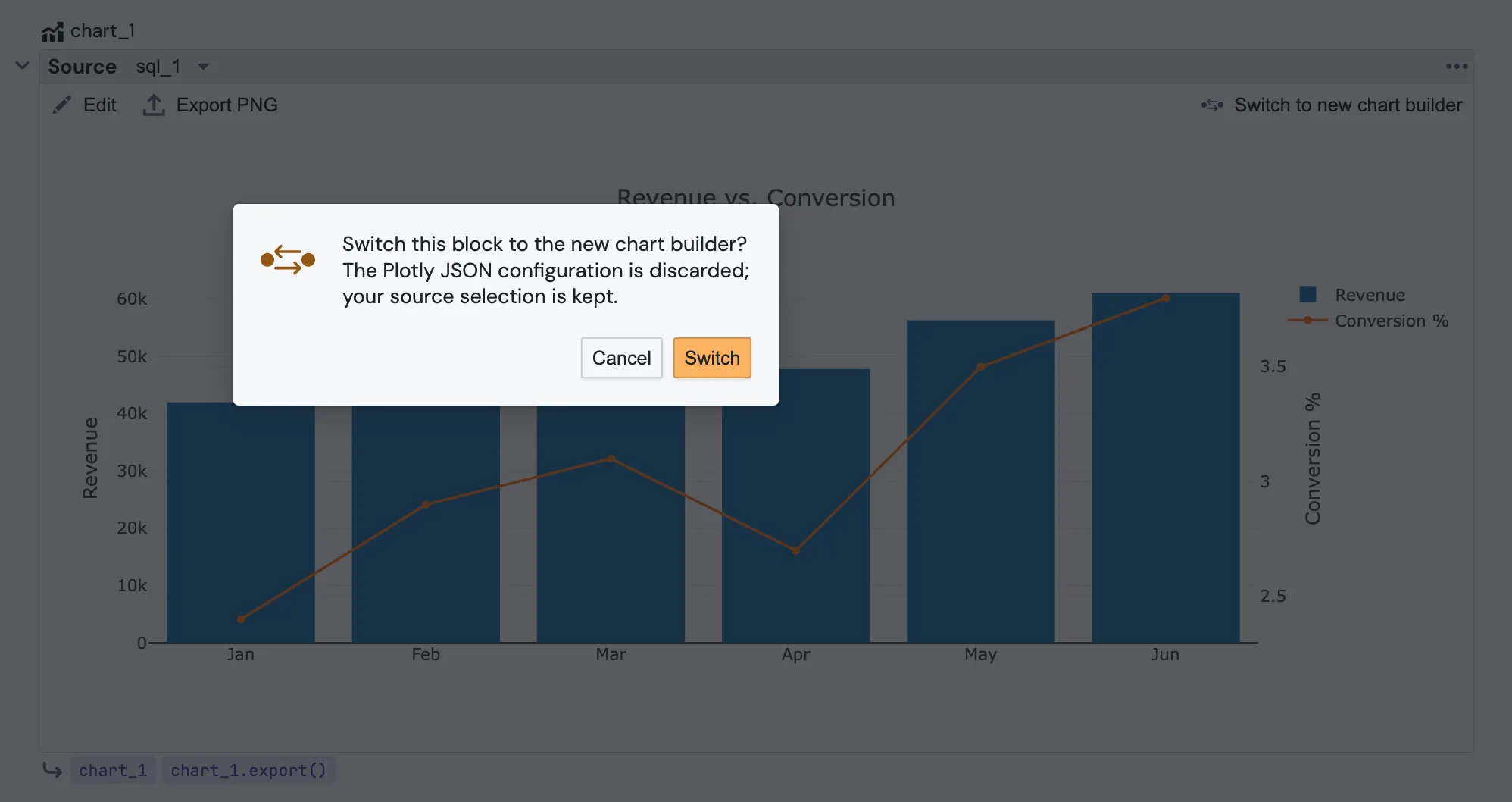
- In a Plotly JSON block, click Switch to new chart builder in the toolbar.
Switching keeps your source selection but discards the chart configuration, because the two formats cannot be converted into each other. A confirmation dialog explains this before anything changes.
Set the default engine for your workspace
New chart blocks open in the chart builder. If your team mostly writes Plotly JSON, a workspace admin can change that: go to Account Settings, find Default Chart Engine, and pick Plotly JSON (advanced). From then on, every new chart block in the workspace starts in the JSON editor.
This only sets the starting point for new blocks. Existing charts stay on whatever engine they use, and anyone can still switch an individual chart at any time.

Tips
- Aggregate in SQL when you can. The chart renders from the query rows; grouping and summing in SQL keeps the payload small and the chart fast. Very large result sets are capped for rendering.
- Group by adds a second dimension that splits a bar/line/area chart into a series per value (e.g. revenue by month, split by region).
- Donut vs. pie: set the Inner hole % to
0for a full pie, or leave it at the default for a donut. - Need charts the builder cannot draw, like dual axis or combined bar and line? Switch the block to Plotly JSON.
- Need to build charts outside a report, with a reusable metric and a saved, shareable view? Use Explore instead, then attach the Explore to a report.