The Chart block has two editors. Most charts are built with the point-and-click chart builder. This page covers the second editor, Plotly JSON, where you write the chart definition by hand as a Plotly figure spec.
Writing JSON takes more effort, but it unlocks the full power of the Plotly charting library: dual axis charts, combined bar and line charts, scatter plots, heatmaps, candlesticks, custom colors, annotations, and everything else Plotly can draw. If the visual builder cannot express the chart you have in mind, this editor can.
Which editor should I use?
| Chart builder | Plotly JSON | |
|---|---|---|
| How you work | Point and click, live preview | Write a JSON spec by hand |
| Chart types | Bar, line, area, donut, bar list, table | Every Plotly trace type |
| Dual axis, combined bar + line | Not supported | Supported |
| Custom styling and annotations | Limited to the built-in options | Full control |
| Best for | Standard charts, fast setup | Advanced or heavily customized charts |
Both editors read from the same SQL sources, render the same server-side PNG when a report runs, and deliver to email and Slack the same way. You are choosing an editor, not a different feature.
Open the Plotly JSON editor
There are three ways to get a chart block into the Plotly JSON editor:
Write the spec
A Plotly JSON spec has two parts: data (a list of traces, one per series) and layout (titles, axes, legend, styling). Instead of pasting data into the spec, you reference columns from your source query with src fields. The chart pulls fresh values from the query every time it renders.
Pick your query in the Source dropdown, write the spec, and click Render Chart to see the result. Format JSON pretty-prints the spec, and the editor shows an inline error if the JSON does not parse.
A minimal bar chart looks like this:
{
  "data": [
    { "xsrc": "month", "ysrc": "revenue", "type": "bar", "name": "Revenue" }
  ],
  "layout": {
    "title": "Monthly Revenue"
  }
}
Here xsrc and ysrc point at the month and revenue columns of the source query.
Column references
Any trace field that normally takes an array of values accepts a src variant that names a source column instead:
| Reference | Fills | Typical use |
|---|---|---|
xsrc / ysrc | x / y | Bar, line, scatter, area |
labelssrc / valuessrc | labels / values | Pie and donut |
textsrc / hovertextsrc | text / hovertext | Point labels and tooltips |
opensrc, highsrc, lowsrc, closesrc | OHLC fields | Candlestick charts |
marker.colorsrc / marker.sizesrc | marker.color / marker.size | Color or size points by a column |
Other src fields (zsrc, latsrc, lonsrc, parentssrc, idssrc, rsrc, thetasrc, locationssrc) work the same way. For everything the spec can contain, see the Plotly figure reference.
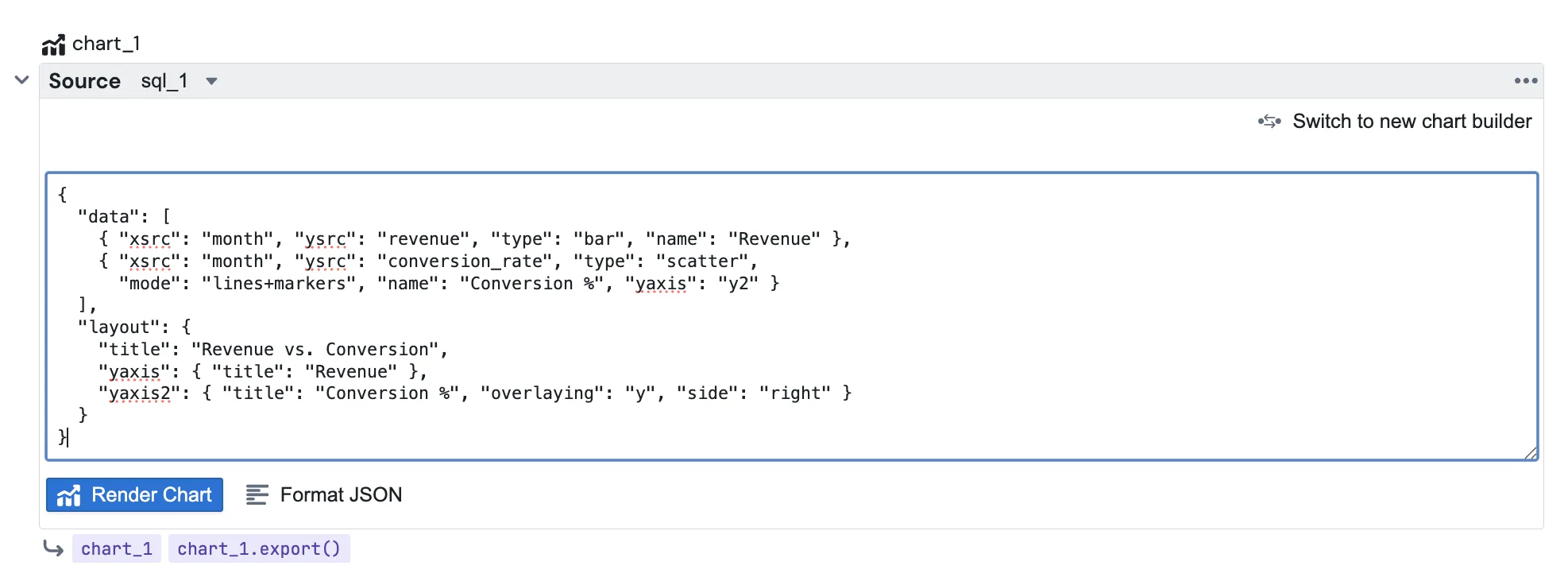
Example: dual axis with bar and line
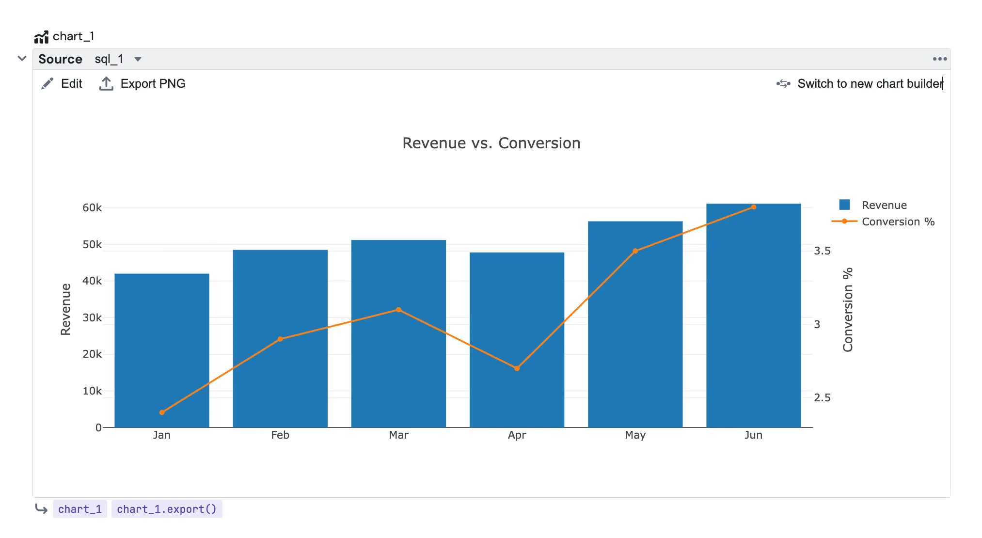
This is the kind of chart that needs the JSON editor. Revenue as bars on the left axis, conversion rate as a line on a second axis on the right:
{
  "data": [
    {
      "xsrc": "month",
      "ysrc": "revenue",
      "type": "bar",
      "name": "Revenue"
    },
    {
      "xsrc": "month",
      "ysrc": "conversion_rate",
      "type": "scatter",
      "mode": "lines+markers",
      "name": "Conversion %",
      "yaxis": "y2"
    }
  ],
  "layout": {
    "title": "Revenue vs. Conversion",
    "yaxis": { "title": "Revenue" },
    "yaxis2": { "title": "Conversion %", "overlaying": "y", "side": "right" }
  }
}
Preview and export
Once a chart is rendered, the block shows the interactive Plotly chart. Use Edit in the toolbar to go back to the JSON, and Preview to return to the chart. Export PNG downloads the current chart on demand.
When a report runs, the block renders a PNG on the server from the latest query results, exactly like a builder chart. Reference it from an Email or Slack block with:
{{ chart_1.export() }}
Attachments, inline embedding with export(embed=True), and file uploads all work the same as for builder charts. See the Chart block page for the full delivery options.
Switching back to the builder
Click Switch to new chart builder in the toolbar to move the block to the visual builder. The source selection is kept, the JSON spec is discarded, and a confirmation dialog explains this before anything changes.