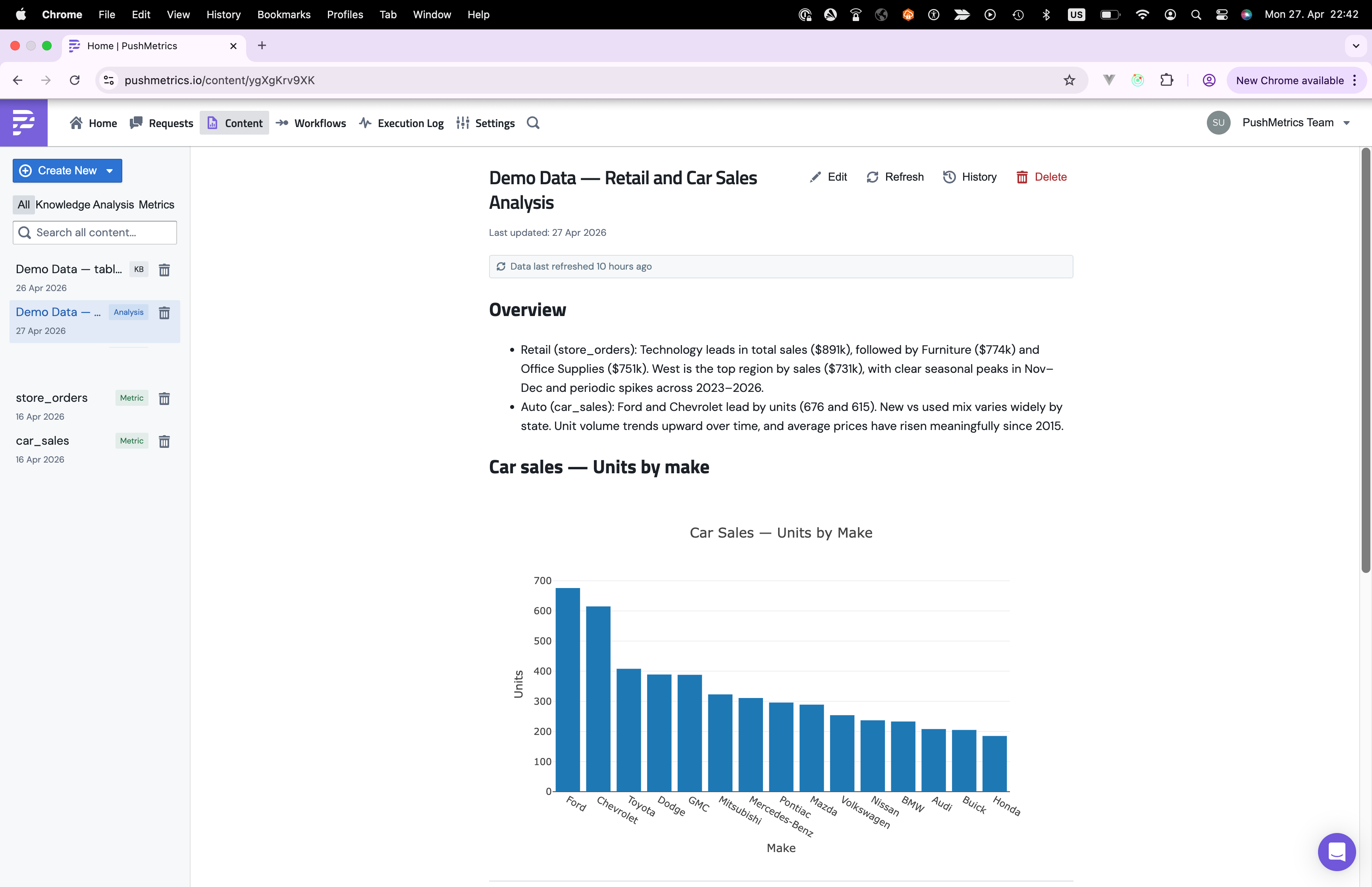
When the agent finishes an investigation, the result usually doesn't belong inside a chat thread. The numbers, charts, and the prose that explains them deserve a stable URL that a teammate can open later without having to re-run anything.
That's what an analysis document is. It's a markdown report with embedded charts, inline numbers backed by SQL, and footnotes that link every claim back to the query that produced it. The agent writes it. You and your stakeholders read it.
Where analysis documents live
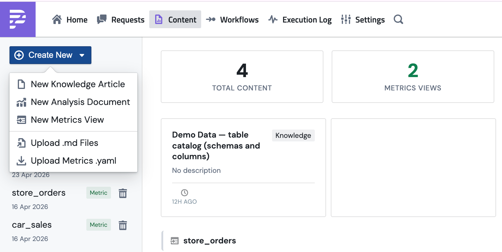
Open Content in the top nav. Analysis documents sit on the same page as knowledge entries and metrics views. Each one has an "Analysis" tag so you can pick them out from the rest.
Each card shows the title, how many sources and charts it contains, and how long ago it was last refreshed. Click into one to see the full rendered document.
Creating an analysis document
There are two ways one gets created.
The agent writes it
Most analysis documents start as a chat. You ask a question like "what drove the March revenue spike", the agent runs queries, sketches some charts, and at the end calls its save_analysis tool. The conversation closes with a link to the saved document.
This is the path you'll use most often. The agent already has the queries, the results, and the narrative ready. Saving it as a document just freezes that work into something you can share.
You start a blank one
If you'd rather draft the structure yourself and let the agent fill in the details, or write the whole thing by hand, open Content → Create New → New Analysis Document.
You can also drop a .md file in via Upload .md Files. That's useful if you're moving an analysis between workspaces or pulling in a draft from somewhere else.
What's inside one
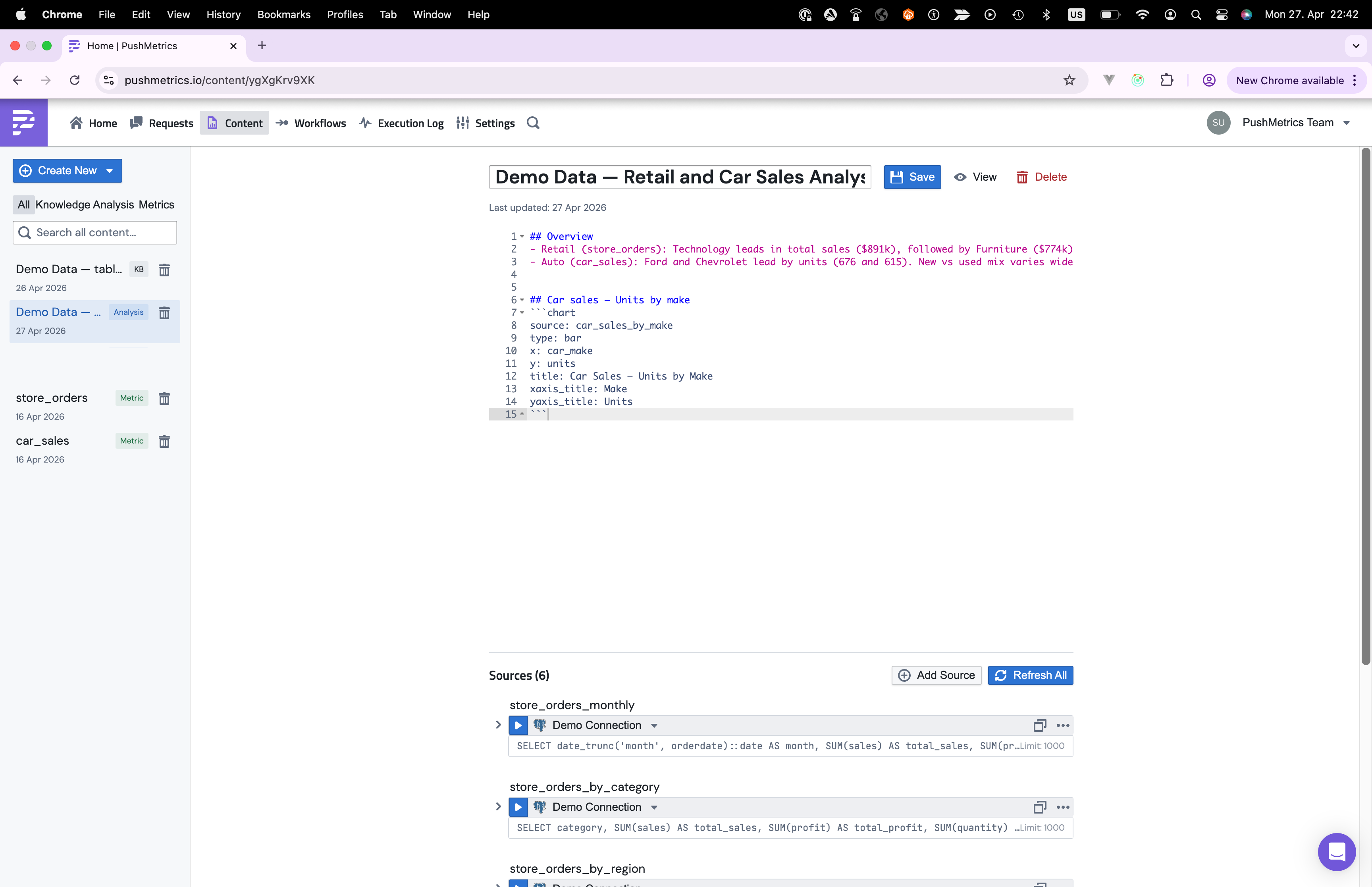
The edit view splits cleanly in two. The top is the markdown body with the prose, charts, and inline query() calls. The bottom is the Sources panel, which lists every SQL query the document relies on. You can run a single source, refresh them all, or open one to edit its SQL.
An analysis document is markdown plus a few extras:
- Narrative text. Sections, headings, lists, anything markdown supports.
- Sources. The SQL queries that ran against your database. Their results are cached so the document loads instantly without hitting the warehouse again.
- Inline values. Numbers in the prose that come from the cached data, not hardcoded. They look like
{{ query("SELECT user_count FROM signups WHERE month = '2026-03-01'") }}. - Charts. Code blocks tagged
chartthat compile into Plotly visualisations. - Footnotes. Every quantitative claim links back to the source query, the filter, and the column it came from.
Here's a small example:
# March User Growth

We added **{{ query("SELECT user_count FROM signups
WHERE month = '2026-03-01'") }}** new users in March[^count],
a **{{ query("SELECT pct_change FROM mom_growth
WHERE month = '2026-03-01'") }}%** lift on February.

[^count]: source: `signups` | filter: `month = '2026-03-01'` | column: `user_count`

```chart
source: signups
type: line
x: month
y: user_count
title: Monthly Signups
```
When the document opens, the cached source data loads, the query() calls run client-side, and the chart and inline numbers render together.
How rendering works
Analysis documents are static snapshots, but interactive ones. Each source query runs against your real database once, and PushMetrics keeps the result around as a Parquet file. When someone opens the document, the cached Parquet is loaded into a small SQL engine that runs inside the browser, and the chart blocks and inline query() calls run against that. The document never reaches back into your warehouse on page load.
A few things worth knowing about how this plays out:
- Loading is fast. The cached Parquet file is small and DuckDB inside the browser is quick. Most documents are interactive within a second.
- The data is only as fresh as the last refresh. If the source query ran yesterday, the numbers in the document are yesterday's numbers. There's a Refresh Data button at the top of the document when you need to pull new data.
- Failed sources don't kill the document. If one source can't load, that section shows an error card and everything else renders normally.
Why every number has a footnote
Every quantitative claim in an analysis document is followed by a footnote. Click it and you see the source SQL, the filter that was applied, the column the value came from, and a link to the full cached results.
This is the part that makes the document trustworthy. Without footnotes, a number is just a number. There's no way to check if it's right, no way to reproduce it, no way to argue with it productively. With footnotes, anyone reading can follow the chain from the claim to the query to the data.
The agent is trained to add a footnote for every number it writes. If you spot one without a citation, push back.
Refreshing the data
Analysis documents are snapshots, not live dashboards. When the underlying numbers move, you refresh.
Click Refresh Data at the top of the document. Every source query re-runs against the database, the new results get cached, and the document re-renders. If a document goes stale and hasn't been refreshed in a while, you'll see a banner suggesting it.
You can also schedule refreshes the same way you schedule a report. Point a workflow at the document and have it refresh on a cadence.
Sharing
Every analysis document has a stable URL. Anyone with workspace access can open it. In Slack or email you can share the link directly, or have the agent post a summary with a link back to the full interactive version.
When to save vs. leave it in chat
Not every chat needs to become a document. Save one when:
- You'll share it. Stakeholders, leadership, the rest of the team. Anyone who wasn't in the conversation.
- You'll come back to it. Quarterly reviews, recurring deep-dives, anything you'll want to compare against next time.
- The reasoning matters. Cases where the how is as important as the what. Assumptions, methodology, edge cases the agent had to handle.
- The numbers will change. A document you can refresh beats a snapshot that goes stale and gets re-asked.
Leave it in chat when the question was a one-off lookup, or when the answer is obvious enough that prose and footnotes would be overkill.