KPI Cards let you display key metrics as prominent, visual cards in your notebooks and reports. They are designed to highlight important numbers at a glance — revenue, user counts, conversion rates, or any metric that matters to your team.
Adding a KPI Card
- Click the
+button next to any existing block to open the Add Block Menu. - Select KPI Card from the block list.
The KPI Card block will appear in your notebook, ready to be configured.
Configuring a KPI Card
Each KPI Card displays a single metric sourced from an upstream SQL query. The configuration panel is on the left, with a live preview on the right.
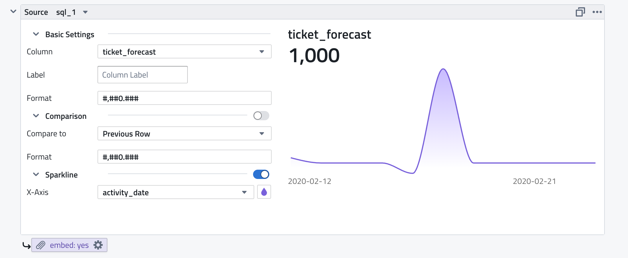
Source
- Source: Select the upstream SQL query to use as the data source (e.g.,
sql_1). The query must return at least one row of data.
Basic Settings
- Column: Choose which column from the query result to display as the main value (e.g.,
ticket_forecast). - Label: A custom label for the metric. Leave as "Column Label" to use the column name, or enter a custom title (e.g., "Revenue", "Active Users").
- Format: A number format pattern to control how the value is displayed. Uses the format
#,##0.###for thousands separators and decimal places. Examples:#,##0— whole numbers with thousands separator (e.g.,1,000)#,##0.00— two decimal places (e.g.,1,000.00)$#,##0— currency prefix0.0%— percentage
Comparison
Toggle the Comparison section to show how the current value relates to another value:
- Compare to: Select the comparison mode:
- Previous Row — compare to the previous row in the query result (useful for time-series data)
- Format: A separate number format pattern for the comparison value.
The comparison appears below the main value, showing the difference or trend.
Sparkline
Toggle the Sparkline section to display a mini trend chart alongside the metric:
- X-Axis: Select the column to use for the horizontal axis (e.g.,
activity_date). This should typically be a date or timestamp column. - Color: Click the color picker to choose the sparkline color.
The sparkline renders as a smooth area chart showing the trend of the metric value over the X-Axis column. This gives viewers immediate visual context for whether the metric is trending up or down.
Layout Options
KPI Cards are designed to work well in a row. Place multiple KPI Cards side by side to create a dashboard header that summarizes your key metrics at the top of a notebook or report.
You can control the card width to arrange cards in grids:
- 2 cards per row — for high-level summaries
- 3-4 cards per row — the most common layout for dashboards
- 5+ cards per row — for dense metric displays
Embedding in Reports
KPI Cards can be embedded in reports using the embed: yes attachment setting (visible at the bottom of the block). When embedded, the card renders inline in the report output rather than as a downloadable attachment. This is ideal for email and Slack report deliveries where you want recipients to see the metric directly.
Example report layout:
- KPI Cards (embedded) — top-line metrics with sparklines
- Charts — trends and visualizations
- SQL Tables — detailed data
Use Cases
- Executive dashboards — display top-line KPIs with sparklines at the top of a weekly report.
- Sales performance — show revenue, pipeline value, deals closed, and win rate with trend lines.
- Product metrics — display DAU, MAU, retention, and feature adoption.
- Operational monitoring — highlight SLA compliance, ticket volume, and response times.
- Slack/email summaries — embed KPI cards in scheduled report deliveries to give recipients a quick overview.